Akamai Media LLC Web Performance Report

A clear look at
Ruhi Zandra's website.

A plain-English review of how ruhizandra.com is working today: what a first-time visitor experiences, how easily the right people find you, and where a few focused changes would make the biggest difference.

Prepared for
Ruhi Zandra · The Open Composition
Website
ruhizandra.com
Site captured
July 14, 2026
Prepared by
Mark Moran
0/100
Strong

Overall website health

This is a well-built, genuinely beautiful site, and now a technically sharp one too. It loads fast, reads clearly, adapts cleanly to a phone, carries a full structured-data layer that AI assistants and Google can read, and passes an automated accessibility scan cleanly. The opportunities left are the ones that build over time on any new practice: sharpening the on-page search signals, and letting visible proof from clients accumulate.

Strong Opportunity Needs attention

Your nine-point scorecard

Every Akamai web performance report looks at the same nine areas: the things that decide whether a website earns trust, gets found, and turns visitors into clients. Each area is scored out of 100, and together they average to the overall score above. Click any card to read the full explanation of that area.

Does the site look current, trustworthy, and unmistakably yours? For a practice built on presence and care, the website is the first felt impression, and this one carries it well.

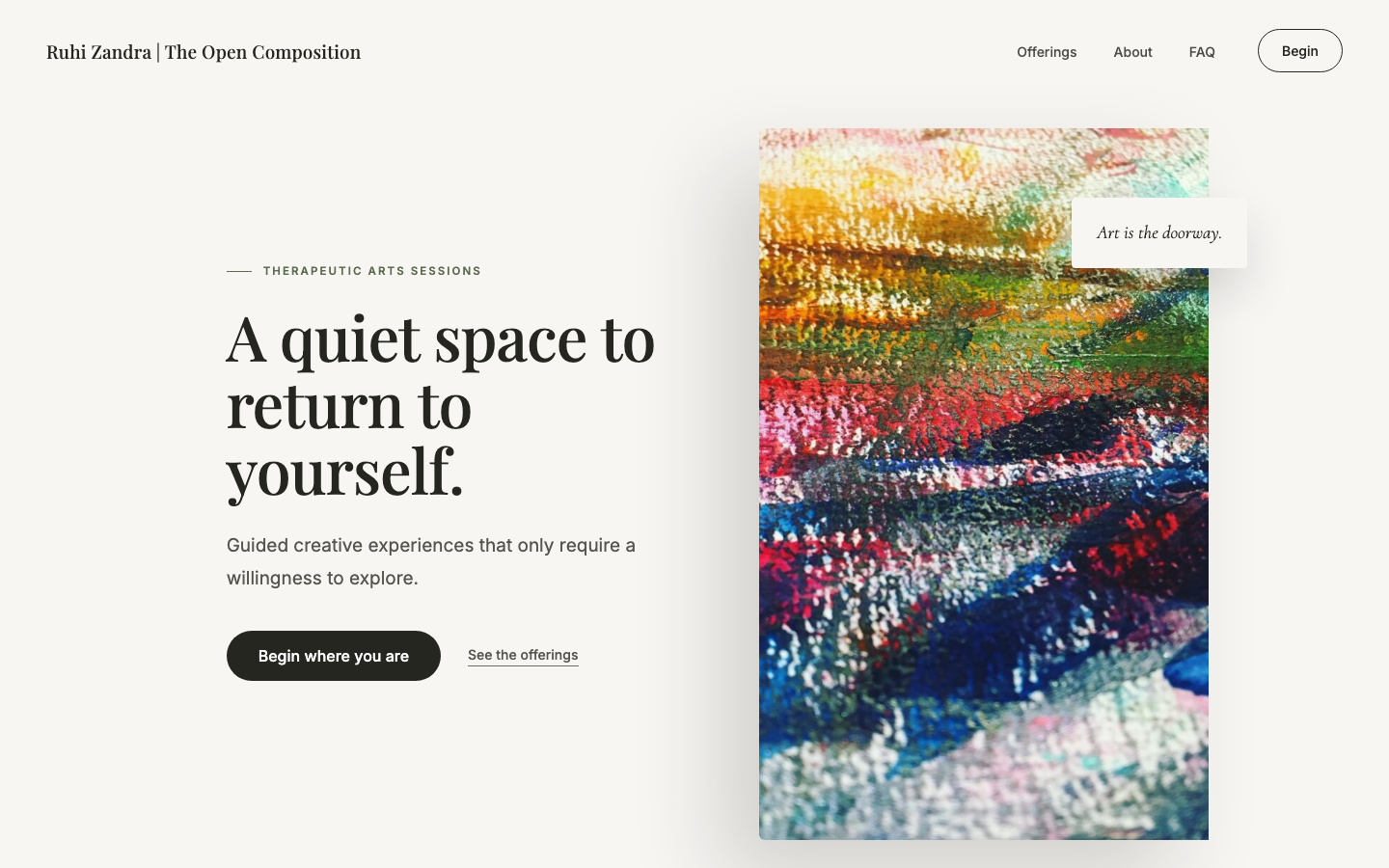
Ruhi Zandra homepage as it appears today: a serif headline reading 'A quiet space to return to yourself' beside an abstract painting
ruhizandra.com homepage, captured July 14, 2026.
What a first-time visitor meets
A calm, confident headline set in an elegant serif, with room to breathe
Warm, earthy palette — sage, clay, and bone, consistent top to bottom
Real art and photography, not stock, including your own portrait
One clear action — "Begin where you are" — above the fold
Working

The design is genuinely distinctive

The whole page feels considered: a refined serif for headlines, generous white space, a soft earth-tone palette, and real imagery carry a single, coherent mood from the hero through the footer. It looks like your practice and no one else's, which is exactly what a personal, presence-based service needs.

Working

Consistency top to bottom

Type, color, spacing, and button style hold together across every section, including the offerings, the About block, the video, and the FAQ. There are no jarring shifts or leftover template pieces, which is where most small sites lose their polish.

Refine

The call-to-action labels vary slightly

The site invites action in a few different ways: "Begin," "Begin where you are," "See the offerings," "Get in touch," and "Schedule a session." Each is fine on its own, but settling on one primary phrase for the main booking action would make the next step feel even more obvious.

Why this matters for the people you serve

When someone is deciding whether to open up in a creative session, they read the website for a sense of safety and care before they ever reach out. This design communicates both. It's a real asset, and the small refinements here are about sharpening something already strong, not fixing something broken.

Can the right people find you when they search Google for what you offer? The technical setup is done correctly, so this is now about giving Google clearer signals and a little time on a brand-new domain.

The technical basics Google checks first
Keyword page title Meta description Canonical link Section headings All images described Search terms in the H1 A place or service-area signal
Your homepage
~630 words
Depth that ranks well
~900+ words
A solid amount of content already. More depth over time, plus dedicated pages, is what compounds.
Working

A strong, descriptive page title

Your homepage title reads Ruhi Zandra | The Open Composition | Therapeutic Arts Sessions. That names who you are and what you do, which is exactly what search rewards. The meta description, canonical link, heading structure, and image descriptions are all in place too. This is the part most sites get wrong, and yours is right.

Gap

The main headline carries no search terms

Your top headline (its H1) is one of the strongest signals Google reads. Yours is A quiet space to return to yourself. It's beautiful and right for the brand, but it contains none of the words people actually search. The small eyebrow above it does say "Therapeutic Arts Sessions," but that carries less weight than the headline itself. Weaving your core term into the H1, or a nearby subheading, would help without losing the tone.

Gap

There's no signal of where you work

The page never says whether sessions are in a particular city, a region, or online. Search leans heavily on place. Stating plainly that you offer sessions "in [your area]" or "online, anywhere" gives Google a group of people to show you to. Right now that's left open.

Gap

A new domain needs time and depth

ruhizandra.com is a fresh domain with no history yet, so rankings will build gradually. Giving each offering its own detailed page and adding the occasional piece of writing is what accumulates authority and brings in searches over the coming months.

Why this matters for the people you serve

You've already done the hard, technical part correctly. The remaining moves are additive: name what you do and where in the places search reads most, and keep giving Google more to work with. That's what turns a correct setup into people actually finding you when they go looking.

When someone asks ChatGPT or Google's AI "who offers creative or art-based sessions?", can it find, understand, and confidently recommend you? This was the biggest opening on the site, and it has now been built out.

What an AI assistant can now tell someone about you
Can read now
  • A named practitioner-service business
  • Both offerings as described services
  • Ruhi, named as the facilitator
  • The full FAQ, in a form AI can quote
  • Business name, description, social profiles
Still builds over time
  • Reviews and ratings (as clients arrive)
Working

The practice is now described in the language AI reads

The site now outputs a full structured-data layer (schema.org): a professional-service business, both offerings as named services, and you, Ruhi, as the named facilitator, alongside the existing website and organization data. An assistant asked what you specialize in can now draw on real, specific detail rather than guessing.

Working

Your FAQ is now machine-readable

All eleven of your FAQ answers, what a session is, whether you need to be artistic, how it differs from therapy, safety, cost, are now marked up as structured FAQ data. That means an AI assistant can lift those exact answers when someone asks, which is one of the strongest ways to get surfaced in an AI response.

Next

Reviews are the one piece that comes with time

The only element an assistant still can't find is ratings and reviews, which is normal for a new practice. As clients share feedback, adding it to the page (and to the structured data) completes the picture.

Why this matters for the people you serve

A growing share of people now ask an AI assistant for recommendations instead of scrolling Google, and those tools favor businesses with clear, structured, detailed information. That layer is now in place, at a moment when very few practices in your field have done it, so an assistant has real substance to name you on.

Is it immediately clear who you help and why they'd choose you? A visitor decides in seconds, and this page answers the real questions with a voice that feels like a person, not a brochure.

Questions a new client looks for — answered on the page?
6 of 6covered
Who you are (warm About)
What each offering involves
What to expect at a session
How this differs from therapy
Whether it's a safe space
Cost and how to begin
Working

A warm, distinctive voice

The writing speaks directly and gently ("You bring whatever you're carrying; the art becomes a way of listening inward"). It's calm, specific, and unmistakably human, which is precisely right for this kind of work and hard to fake.

Working

The FAQ does real work

Eleven honest questions, including the ones people are nervous to ask: "Do I need to be artistic or creative?", "How is this different from therapy?", "Will this be a safe space?", and "How much does a session cost?" Answering these on the page removes the exact hesitations that keep someone from reaching out.

Refine

Room to go deeper over time

The homepage runs a healthy amount of copy, and the two offerings each link to their own page. As the practice grows, giving each offering more depth and adding the occasional reflective piece will strengthen both the messaging and search at once.

Why this matters for the people you serve

People reach out when their questions are answered before they have to ask them. This page already does that unusually well. The content isn't a weakness to fix; it's a strength to keep feeding as you add offerings and stories from real sessions.
Can a visitor get from landing on the page to booking without friction? Every extra step between interest and action quietly costs sessions, and here the path is short and complete.

The path from landing to booked
Step 1
Lands and grasps the offer instantly
Step 2
Understands the two offerings
Step 3
Gets questions answered in the FAQ
Step 4
Books a time — real scheduling
Working

The path to booking is short

A clear action sits above the fold ("Begin where you are"), the offerings and FAQ answer the natural next questions, and the site offers real self-scheduling rather than a callback request. A motivated visitor can go from arriving to booked in a couple of steps.

Working

Multiple, low-pressure entry points

"See the offerings," "Get in touch," and "Schedule a session" give people a way in whether they're ready to book or just exploring. The tone stays inviting rather than pushy, which fits the work.

Refine

One primary action would sharpen the funnel

Because several buttons compete gently for attention, choosing a single, repeated primary action for booking (and letting the others stay secondary) would make the intended next step unmistakable. A small tuning of something that already works.

Why this matters for the people you serve

Letting someone choose a time in the moment they feel ready is what captures a session that a "contact me" form often loses. That capability is already here. The only lever left is making the single most important action the most obvious one on the page.

Are the signals there that tell a first-time visitor you're the real thing? Most are, and the one that's missing is the one a brand-new practice naturally lacks: proof from other people.

Trust signals a new client scans for
Secure connection
Real photo & bio
Honest about the work
No testimonials yet
No named credentials
Working

The fundamentals are in place

The site is secure (HTTPS), your real portrait and a genuine bio ground the practice in a real person, and the writing is refreshingly honest about what the work is and isn't. That candor, especially the "how is this different from therapy" answer, builds trust rather than overclaiming.

Gap

There's no proof from other people yet

Testimonials are the single most persuasive trust signal for a personal service, and none are shown. This is completely normal for a new practice, and it's the highest-value thing to add: even two or three short quotes from early participants would do real work.

Gap

Your background could be stated more concretely

The About section speaks to two decades of creative work in education, film, and community. Naming any relevant training, facilitation experience, or affiliations, in your own measured way, would add a layer of credibility without turning it clinical.

Why this matters for the people you serve

Someone deciding whether to be vulnerable in a session looks for evidence that others have done it safely. The site already feels trustworthy; adding real voices from the people you've worked with is what turns "this feels right" into "other people I could be like have done this."

Can everyone actually use your site, and where are you exposed to compliance risk? This is now one of the strongest areas on the site: an automated scan returns a clean result.

Automated accessibility scan — 0 issues found
No violations detected
AAAAAA
Web accessibility grade
"AA" is the accessibility grade the law effectively expects a business website to meet, and this site now sits cleanly at it. Images are described, headings and landmarks are structured correctly, and there are no contrast failures or serious barriers, the issues that drive most accessibility complaints and ADA demand letters.
Working

Every image is properly described

All four images on the page carry alternative text, so screen-reader users get the full experience. That single detail is missing on the large majority of small-business sites, and here it's handled.

Working

The one structural flag has been cleared

An earlier scan flagged a duplicated "footer" region (two areas labeled as the page footer, which assistive tools prefer to see as one). That has been resolved, so the page now presents a single, clean set of landmarks for screen-reader users to navigate by, and the automated scan comes back with no violations.

Why this matters for the people you serve

Accessibility is both the right thing to do and the area where small businesses face surprising legal exposure. A clean automated result puts this site in rare shape, protecting both the people who rely on assistive technology and you.

Does it work and look right on phones, not just the desktop it was designed on? More than half of visits will arrive on a phone, and the layout handles that beautifully, with the tap ergonomics now tightened up too.

On a phone
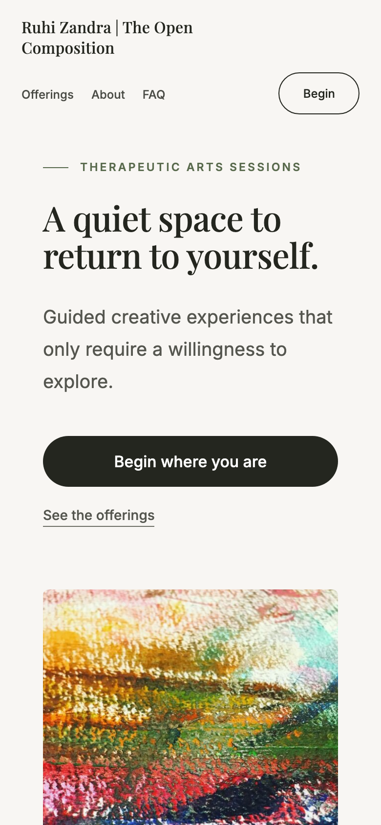
Ruhi Zandra homepage viewed on a mobile phone screen, showing the headline, subtext, a full-width button, and the hero artwork
ruhizandra.com on a phone-sized screen, captured July 14, 2026.
Fits the screen — proper viewport, no sideways scrolling at all
Reads big and clean — large type and a full-width, easy-to-hit main button
Comfortable tap targets — navigation, buttons, footer links, and social icons now sized for easy tapping
Working

The layout adapts cleanly

On a phone the page fits perfectly with no horizontal scrolling, the headline stays large and readable, and the primary button spans the width so it's easy to tap. The mobile experience feels designed, not merely shrunk.

Working

The tap targets have been enlarged

The navigation, buttons, footer links, and social icons now carry enough padding to hit comfortably on a phone, with the hit areas grown behind the scenes so the visible design is unchanged. The small links that remain are a few slim in-text links, which is standard and accessible.

Why this matters for the people you serve

The essentials already worked on mobile, and now the everyday actions, opening the menu, tapping a link, following you on social, are easy to hit on the first try. That makes the site feel effortless on a phone, which is where most people will first meet it.

Does it load fast enough to keep people from leaving before it even appears? This is one of the site's real strengths: it's fast and carries very little unnecessary code.

88/100
Strong
~0.6sFirst content appears
~0.9sFully loaded
235KBJavaScript the page loads
Working

It loads fast, on a lean foundation

The first content appears in about 0.6 seconds and the page settles in around 0.9 seconds. Just as important, it ships only about 235KB of JavaScript and no separate stylesheet files, a fraction of what a typical template-heavy site carries. Visitors are never left waiting on a blank screen.

Gap

The images are the main weight

The heaviest single item is a collage image served at around 440KB and full 1536×2048 resolution. Right-sizing it and the other photos, and serving them in a modern format (WebP or AVIF), would trim the page meaningfully with no visible quality loss.

Gap

The background video is the largest asset overall

The pottery video in the middle of the page is the biggest thing the page loads. It's a lovely touch; making sure it loads only when scrolled into view (and is well compressed) keeps the fast first impression intact as more people visit on mobile data.

Why this matters for the people you serve

Speed is already excellent, and the lean build is a genuine advantage. The only opportunity is trimming the images and video so the site stays this fast as it grows, rather than slowly getting heavier over time.

Already done, and what's next

The technical layer is now in place

Since this review, the structured-data layer, the accessibility flag, and the mobile tap targets have all been addressed, which is what moved the score up. The moves that remain build over time on any new practice. Here's where I'd focus next.

1

Sharpen the on-page search signals: keywords and a place

Weave your core term ("therapeutic arts") into the headline or a nearby subheading, and state clearly whether sessions are local, regional, or online. Two small content edits that give Google a specific audience to show you to. This is the main lever left for search.

Effort: minimal · Impact: high
2

Start gathering and showing testimonials

As you work with early participants, collect two or three short quotes and add them to the page. Proof from real people is the one trust signal a new practice most needs, and the most persuasive thing you can add.

Effort: light & ongoing · Impact: high
3

Right-size the images and video as the site grows

The page is already fast. Compressing the larger photos and the background video, and serving them in a modern format, keeps it fast as more people visit on mobile data and as you add content over time.

Effort: light · Impact: keeps speed strong

Want to talk through the findings?

This report walks through all nine areas of the site's performance, with the highest-impact opportunities called out. I'm glad to talk through what would make the biggest difference next, and where I'd start.

Prepared by Mark Moran · Akamai Media LLC · akamai.media