Draft for review
Brand Style Guide
Ruhi Zandra
Version 1Visual Direction
Ruhi Zandra is quiet, spacious, and grounded. Cool earth tones (sage, fog, graphite, bone) replace anything bright or polished, and generous white space does most of the work. Playfair Display gives headings a slightly poetic, timeless feel without turning ornate, and Inter keeps everything else calm and legible. Nothing here should read as a wellness brand chasing trends. It should feel like a held breath.
“Art is the doorway. Remembering yourself is the destination.”
01 · Color
Color Palette
Sage leads as the primary color. Fog is a cooler, quieter secondary for subtle variation. Graphite anchors dark sections and text. Bone is the base, never pure white.
Sage, primary
Fog, secondary
Graphite & Bone, neutrals
Surfaces: Bone white (#F8F6F3) is the default background, never pure white. Cards and form fields sit on true white for a subtle lift. Sage ultra light works for gentle alternating sections and pullquote backgrounds.
02 · Type
Typography
Playfair Display carries headings with a little poetry, without tipping into ornate. Inter handles everything readable. Cormorant italic is reserved for pullquotes and affirmations, the brand's most distinctive typographic move.
H1Playfair Display · 52px · 3.25rem · 600
A quiet space to return to yourself.
H2Playfair Display · 36px · 2.25rem · 600
Rooted in authenticity
H3Playfair Display · 24px · 1.5rem · 600
Navigating a transition
BodyInter · 17px · 1.0625rem · 400
Guided creative sessions for reflection, grounding, and presence. No art experience is needed. The focus is on process, not outcome.
SmallInter · 14px · 0.875rem · 400
Each session begins with a conversation. I'll respond personally to help you find the right space.
CaptionInter · 12px · 0.75rem · 400
Photo caption or metadata text, always muted.
AccentCormorant Italic · 26px · 1.625rem · 400
“Come as you are. Leave a little more connected to yourself.”
03 · UI
Components
The core interface elements, matching what's already on the wireframes. More can be added as the build takes shape.
Buttons
Links
Questions about a session? Get in touch and I'll respond personally.
Form Fields
Checkboxes & Radios
Pullquote / Affirmation
“Art is the doorway. Remembering yourself is the destination.”
04 · Imagery
Imagery Direction
AI-generated reference imagery showing the direction: natural light, muted sage and warm-neutral tones, candid and unposed, slight film grain rather than polished stock-photo gloss. Useful as placeholder and mockup imagery, not final assets.
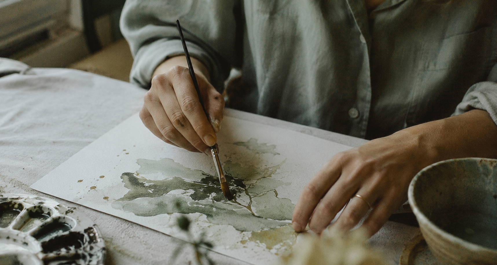
Process shots
Hands mid-motion, materials in use. No staged "finished art" shots, the focus stays on process.
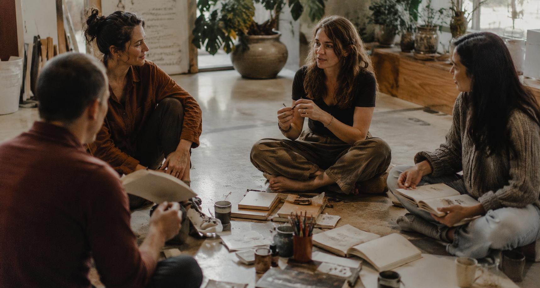
Group / circle sessions
Candid mid-conversation, nobody posing for the camera. Warm, quiet, unstaged.
Still needed: a real portrait of Ruhi. AI reference imagery works for process, texture, and group-session mood, but her own photo can't be AI-generated and still needs to be sourced separately (natural light, relaxed, not a posed headshot).
05 · Layout
Layout Preview
A quick look at the palette and type working together. Rough preview of the feel, not a final design.
A quiet space to return to yourself.
Guided creative sessions for reflection, grounding, and presence. No art experience needed.
“Art is the doorway. Remembering yourself is the destination.”
Bone-white hero with a graphite pullquote band, sage accents throughout.
06 · Accessibility
Contrast Check
Key color pairings checked against WCAG 2.1 guidelines. AA is the standard target for body text.
Aa
Headings on bone white
14.19 : 1
Aa
Body text on bone white
6.88 : 1
Aa
White on graphite section
10.80 : 1
Aa
Button text on sage
5.12 : 1
Aa
Link on bone white
5.34 : 1
Aa
White on sage-ultra-dark button
5.76 : 1
Note: the lighter sage-dark and sage-base tones (#7C8B70, #A9B79E) fail AA for small text on white and should stay decorative (swatches, borders, large display type) rather than carry body copy or links.